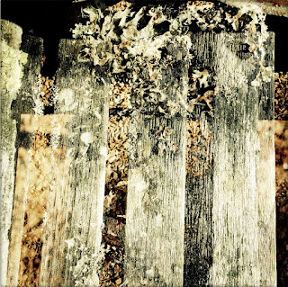
The bench used for the double exposure here was not actually in a park, but rather a part of the smaller courtyard here at school. The texture of weathered wood is always fascinating to me, and the sunlight striking both the wood and the moss at the end of the bench gave me a vision that anticipated the effect that resulted here. I used the "Hipstamatic" app, which is a constant favorite, and which also has a double exposure button. I am always astonished by the result and I have learned over the years I have used it that it requires a fairly accurate understanding of overlapping light and how one image can "affect" another. Even images shot in reverse order have a very different look from one another.
For this one I like the texture, obviously, and the geometric structure of the plank lines in the composition. I didn't do anything with the color, but the washed out look is very fitting for this image as the planks were sun faded and soft gray in the relatively bright sunlight. The layered look of the piece also gives it a depth that I find interesting as the top layer reveals portions of what rests below it.


No comments:
Post a Comment